
PARTNER TRAY
Hulu Main Website
I was tasked with integrating network brands and their content into the homepage—a balancing act between preserving the core design language and giving each brand a distinct voice. The challenge lay in maintaining visual harmony while allowing for differentiated expression. The opportunity, however, was significant: surfacing premium partner content in a cohesive way that enriched the overall portfolio and expanded the value of the platform.

While the initial ask was focused on a single integration—“What would Machinima look like on Hulu?”—I approached the challenge with scale in mind. I explored how premium networks could be seamlessly woven into the existing navigation framework, ensuring consistency without compromising brand distinction. This also raised important questions about hierarchy and relationship: How would a brand like Machinima coexist alongside a network like Showtime? The goal was to design a flexible system that could accommodate a diverse range of content partners while preserving a cohesive user experience.

I explored a range of layout variations, sketching numerous combinations to identify strategic moments where a brand could surface on the homepage without blending into a sea of uniform content trays. The goal was to create visual distinction and hierarchy, ensuring partner brands had a meaningful presence while maintaining overall design cohesion.

The masthead was the most visible entry point, but the existing framework offered limited flexibility—restricted to background image swaps and text edits. As a result, the presentation often felt generic, making it difficult for new or distinctive content to stand out. I saw this as a key opportunity to rethink how we could give standout titles a more differentiated presence within familiar constraints.

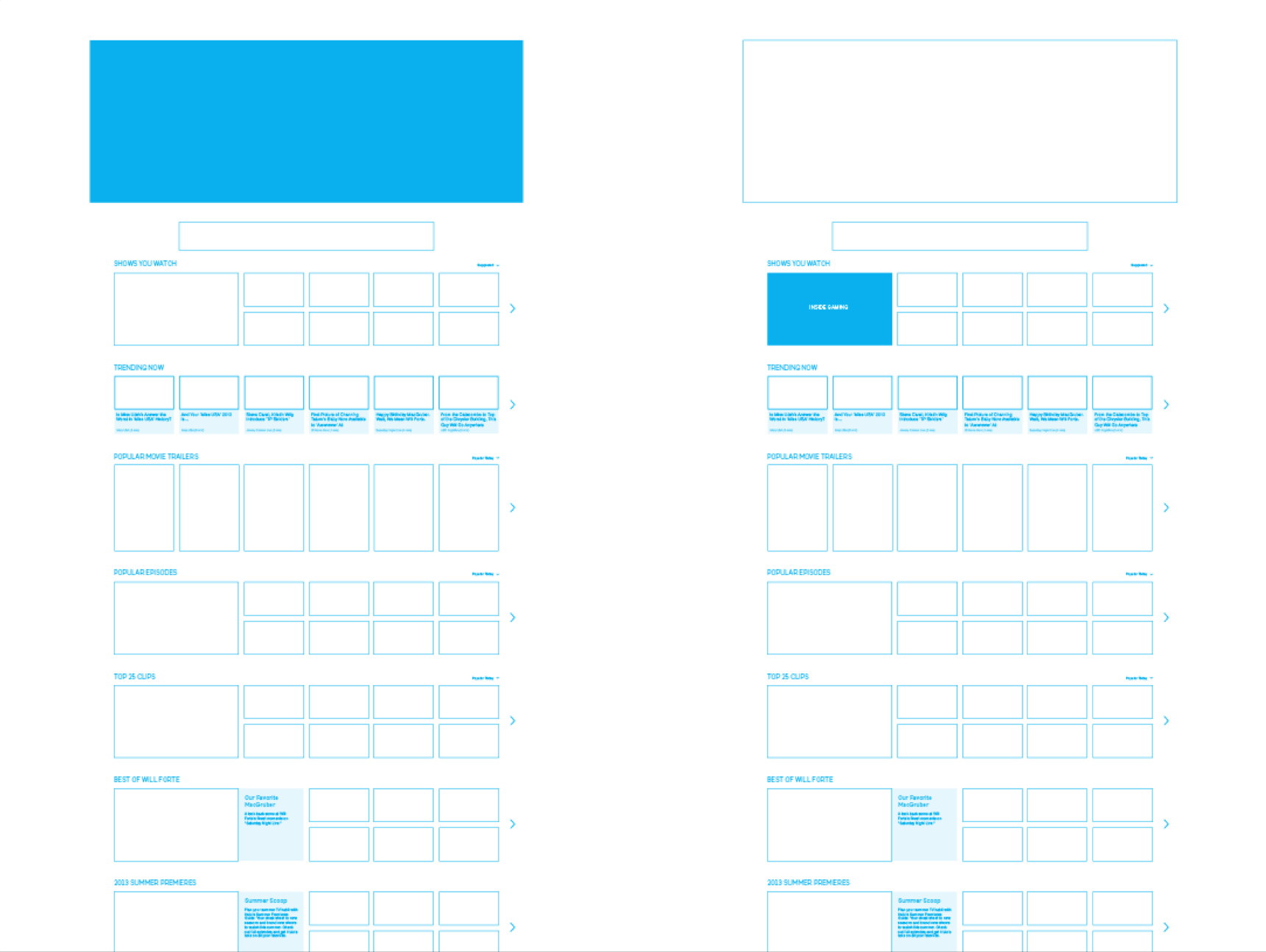
Introducing a dedicated content tray was a logical next step, but it posed a challenge: for users unfamiliar with the Machinima brand, it risked blending in with the surrounding, similarly sized trays. I needed to find a way to surface the content with enough visual distinction and context to spark curiosity—even for those encountering the brand for the first time.

Incorporating the Machinima logo within the tray began to create a sense of brand presence, but the execution lacked refinement. I also considered scalability—if multiple partner trays followed the same pattern, the homepage risked becoming visually repetitive. The challenge was to strike a balance between brand recognition and a polished, scalable design system.

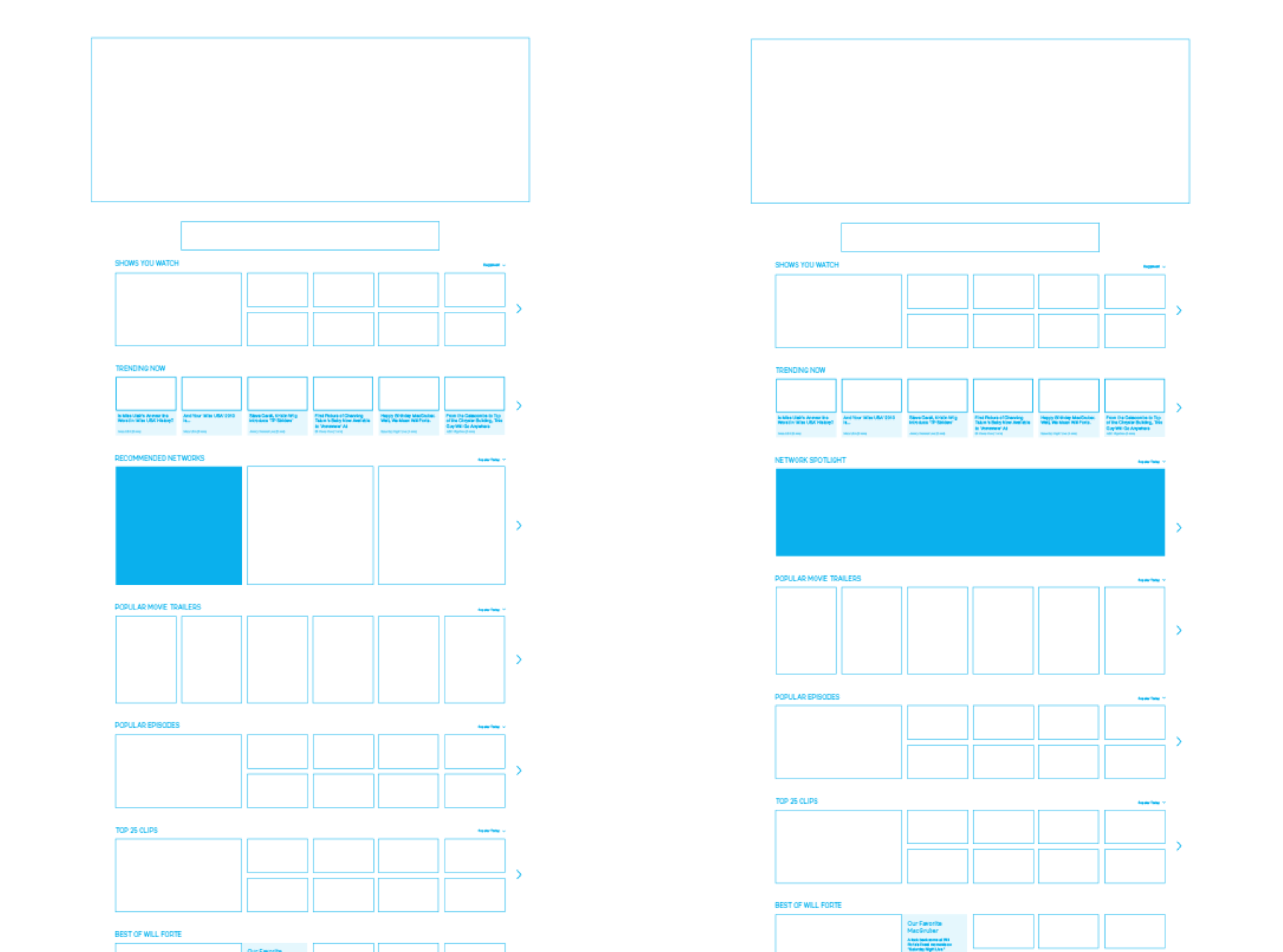
After multiple iterations of sketches and mocks, the solution took shape: a differentiated template tailored for brand visibility. Rather than isolating each network in its own tray, a unified multi-brand tray provided a more elevated and discoverable experience—especially for lesser-known networks. While the final design marked a slight departure from the existing template, it remained a natural evolution of Hulu’s visual language. This concept was later used in strategic discussions with content partners to demonstrate the viability of brand integration. On the backend, the tray dynamically surfaces based on each user’s viewing habits and interests, with its effectiveness rooted in the recommendation engine delivering relevant network content at the right moment.